27/06/2011

Into the East

Plans are afoot!

At some point last year I found out that Flatford Mill where Constable famously painted his Haywain was mostly unchanged since Constable's time. As an artist that cites Constable and the Romantics as influences in my work (the very notion of the idyllic landscape influencing tourist memorabilia, including postcards) I was intrigued by this. The idea that this kind of place remaining unchanged seemed not only wonderful in modern Britain, that to my mind is losing much of it's heritage but also fitting to the romantics idea of celebrating the English landscape.

I decided that I wanted to recreate the Haywain and produce the same view in my own style. How exactly this will look remains to be seen but I did decide to go visit Flatford mill and see for myself.
This led to wondering how many more of the scenes in Constable's paintings have remained basically recognisable to this day. I found an amazing little map on the internet based on ordnance survey that shows not only the area of Dedham Vale with close ups of the key locations but also recommended walks to explore Constable country but also the location of where Constable stood to paint his pictures.

At the same time there are plans afoot to go to the Cambridgeshire fens region. What the reason for picking that region is I will reveal later when things are more fixed. I am however compiling a list of tourist hotspots that I should visit.

Since both areas are relatively close to each other I decided to split a week in both locations. On the 15th July I will be off to Ely and staying a few days in a B & B there, taking visits to the surrounding countryside and towns. Doing my usual thing of exploration, buying postcards and getting tourist imagery and photographing anything and everything. I will then be off to Constable country staying in a Travellodge for a couple of days and exploring Constable Country using my exciting new map.


24/05/2011

Update on the Orang-utan

As I said, I have been asked to paint an Orang-utan for The Elephant Family's Jungle City Edinburgh and my design, much like last years Elephant, includes both a sunny, blue-skied side and a threatening, stormy side. Any of you who know anything about my artwork will know that I am obsessed with the postcard and the tourist image, more specifically taking touristic images and removing the usual blue sky and replacing it with something more threatening and unusual to the stereotypical notion of the postcard. These themes influenced my elephant and influence my Orang-utan by making them two sided and using the different skies.

Reverse: Stormy Sky, beginnings of greenery and Hornbill
Front: Blue sky, hands and some greenery

Last years elephant was very easy to make two sided, he had almost identical sides with just a few changes. This year I didn't want to do that exact concept again and the Orang-utan is not by nature an easy animal to make two sides of. He is very much a front important animal and the concept had to recognise that. I also wanted to make a point of him being in Edinburgh.

Front: Greenery continued, Edinburgh Castle and Nelsons Monument

So I decided to have one side include a conglomeration of Edinburgh sights. I was tempted to recreate an iconic Edinburgh scene like you might see on a postcard of that place, however having never gone there I was lacking quite a bit of context that I would normally prefer to have before picking and recreating an image. After looking at Edinburgh tourist websites I settled on three possibilities, Edinburgh Castle, Holyrood Palace and Nelsons Monument.

Reverse: Jungle scene including Tiger and Elephant

I decided to have the other side be a general jungle/densely wooded scene and incorporate all the animals in Jungle City, just as I did for the elephant. I decided that the stormy sky would be best on the jungle scene for two reasons.

  1. While the Jungle frequently has storms and sudden downpours, by having the threatening sky over the animals it does highlight, hopefully that there are other things that threaten them, namely human changes to their habitat, something that is important to the cause.
  2. Scotland, and so it's capital, has the stereotype that it is always raining. It seemed to make sense to put the blue sky here for no other more reason than to break stereotypes. Something I very much like doing.
Front: Greenery close to completion.
Reverse: Greenery completed, crocodile can be seen, flowers started.

Finally I decided to have the jungle scene on his back because he is such a front facing animal. For people seeing him in the streets of Edinburgh the first thing they might think about is that fact there are all these animals in Edinburgh and isn't it grand. The sights of Edinburgh being on his front reinforce this feeling but if you make the effort to look all around him you will find another deeper message. It highlights that the plight of the animals they are seeing around Edinburgh in sculptural form and in their native habitat can easily be forgotten or hidden from view. Hopefully the spectacular lightning strewn sky and slight encroachment by one or two of the animals from the back side onto the front side will encourage people to look all around him.


29/04/2011

Jungle City Edinburgh 2011

Finally I get to tell you all about this!

A few months ago I was approached by the Elephant Family, with whom, if you recall, I painted a life-size adolescent fibreglass elephant for last summers Elephant Parade in London. This time they had grand plans to turn fringe season Edinburgh into a jungle with many animals rather than just elephants.

As you may know the Elephant Family is a charity devoted to the protection and conservation of the asian elephant in the wild. The London Elephant Parade aimed to raise 2 million pounds to go towards securing corridors of land connecting current elephant habitats. In the end it managed to raise over 4 million pounds, a resounding success and a real boon towards protecting the elephant.

Jungle City Edinburgh recognises that there are many other endangered species that share the elephants habitat and that by protecting the habitat for the elephants they are also protecting it for all the other species that live there. As such, Edinburgh in August and September will abound with over 150 life-size sculptures of Elephants, Rhinoceros Horn-bills, Tigers, Crocodiles and Orang-utans.

Edinburgh will be a Jungle! More information here: http://www.jungle-city.org/index.html


Well I have been asked to paint an Orang-utan and more will be revealed on that later. Meanwhile if you have Flickr, Twitter or Facebook you can now follow his progress. I am posting photos online, 1 maybe 2 a day as he progresses. They are going up on Flickr but I tend to link to them online in other places too.

Flickr: http://www.flickr.com/photos/noblueskies/

The blank canvas


22/04/2011

Bracknell's Giant Postcard

Been really busy over the last few months.
  • There is a new secret project getting started right now, a project that I fervently hope will become less secret over the next few days. I am itching to tell everyone!
  • The 6 weeks prior to Easter holidays were spent doing some creative partnerships work at Ashmead Combined School in Buckinghamshire. I plan to blog about that soon. It needs a separate post.
  • However last weekend I got involved with a community art project in Bracknell Town Centre.
It was a little last minute but so much fun! 

Original constructed image of Bracknell

So the story goes:

In March a friend of mine, fellow intern at South Hill Park and all round fab arty graduate Sophie Williams spent a weekend creating and teaching others to up-cycle clothes. In this case taking old, donated and charity shop clothes and embellishing, cutting up to add to other clothes and generally making the old, dilapidated and unfashionable exciting and cool again.

The project entitled Fashion Fixers aimed to get the youth (14-18) of Bracknell to be creative and think about ways to turn old stuff they no longer like into new stuff. A really great ethos especially in this time of financial crisis. 

Setting up with the Water Clock Fountain in the background

Everything made over that weekend was then exhibited and sold last Saturday in a generously donated empty shop in Bracknell Town Centre. The project was partially made possible due to an initiative called ITVFixers (yes the TV station!) along with a lot of hard work by Sophie and some really generous donations. All the proceeds from the sale of the clothes went to Project 125.

Sophie is part of South Hill Park's young producers board “Missed Out” and there were plenty of others from that group who helped both in the lead up and subsequent clean up as well as on the day.


Mayor of Bracknell Forest painting


So where do I come in???

Well I'd seen all the build up to the exhibition, so knew exactly what ITV fixers were talking about when I got an email from them via ReOrsa, the Thames Valley Artists group I am a part of. They wanted to involve the community in a project on the Saturday as well as having the exhibition and were looking for a professional artist (painter) to do something. So I proposed a giant postcard of Bracknell and that's what we did.

Many young helpers


We had lots of support from both “Missed Out” and the people of Bracknell, including Bracknell Forest Mayor Cllr Ian Leake, all helping to paint the image side of the “postcard”. Everyone who painted was asked to write something about Bracknell, generally what they liked about it, which would then be added to the reverse of the “postcard”. 
 
Final painted image

Reverse of giant postcard

More photos on my Flickr page here.

30/03/2011

Southwold Reprise

It was almost 2 months between taking the photos in Southwold and starting to paint my new paintings. It doesn't usually take me that Long to photoshop a few photos, in fact now as I write this I have no idea why it took so long, I can only assume that paperwork and admin got in the way as it continues to try to do.

Oh well, no matter! When I started the new paintings I was working fairly obsessively on them. Granted the resurgence of the cold weather and the ever present distracting paperwork continued to sap my time and enthusiasm, yet I found myself looking forward to the point in the week when I could get on with them.

I finished them a few months back in early January I thought it time to update you all on their progress. Well actually I wanted to do that months ago but the finished paintings proved very had to photograph accurately and I wanted to show you them as they grew. While painting I was uploading occasional images to Twitpic and tweeting about them.

As it stands there is no particular place they are going to when I get done. And I will admit it seems really strange to be blogging about paintings that have no specific project behind them. As most of 2010's paintings were very much project led. However Southwold has kind of taken over my practice, with many drawings already completed, 2 more paintings on the go and prints being made based on the drawings.
Below first: Greetings from Southwold


and Walberswick Ferry


20/03/2011

Spring has sprung

Or at least I think it has. Where I go for my weekly walks I see very few signs that spring has arrived. The largest is probably the return of the geese and while I've seen the crocuses come and go the pond seems slow to become green. However the sun is feeling stronger and the smell of spring was almost in the air the last Saturday I went out.

Week 13 - 12th February 2011
Spring may come slow to the pond but I know it well enough to know that while I don't see the snowdrops and daffs that festoon other places (places I walked around last year), there will be hordes of bluebells soon enough.

Also the biggest change, while I can't say shows for sure the return of spring, is a welcome return of sunny days. After weeks of winter and Saturdays full of dull cloud, now I have had many Saturdays with at least partial sunshine.

Week 14 - 18th Feb 2011
This is proving to be an issue currently, however. I love the sun but it seems that it is making taking my photos difficult, since for the time being I have to take my images directly into the sun. Either I get blue sky and silhouetted landscape or I get bright white sky and slightly darker than it should be landscape.
Week 15 - 25th February 2011

I knew when I started that I might have this issue but hopefully when full spring/summer comes along the sun will be overhead enough not to intrude as much. I'm afraid that I picked one of my favourite views rather than one that will always photograph fairly accurately. Maybe this just shows that to attempt to get an objective truth of a place you have to be completely objective picking your subject. But surely this would negate the other aspects of a place/view, your love of it and the emotion that it inspires, without this does it cease to be art?
Week 16 - 5th March 2011

Meanwhile enjoy a selection of the latest few weeks photos. 

Week 17 -  12th March 2011
 

05/02/2011

Secrets - Part Deux

So another secret project is enough off the ground to talk about.
Secret project 4 as I have said is printmaking based. Taking inspiration from (as usual) postcards and touristic imagery and using a monoprinting process called drypoint I have recreated a selection of my drawings into black and white prints.

It took a little while to hit on drypoint as a good process for what I wanted. I tried a woodcut but the result was too blocky. Trying to recreate a fine line using a relief process is not at all easy. However, drypoint is a process where you etch lines into a sheet of perspex (or metal, but perspex is cheaper and easier) using a needle like implement. The ink then sits in the grooves you have made and is transferred to the paper when pressure is applied.

Original Photograph

So why make prints of drawings? Well I love the drawings, but sometimes I'd also like to see them with colour. Now I'd never want to colour them as they are because it would dirty the concepts and reasons for them having among other things, black skies. However I was particularly intrigued by the process of printing and it's ability to recreate images on many surfaces. So taking inspiration from my drawings I created drypoint plates from them.

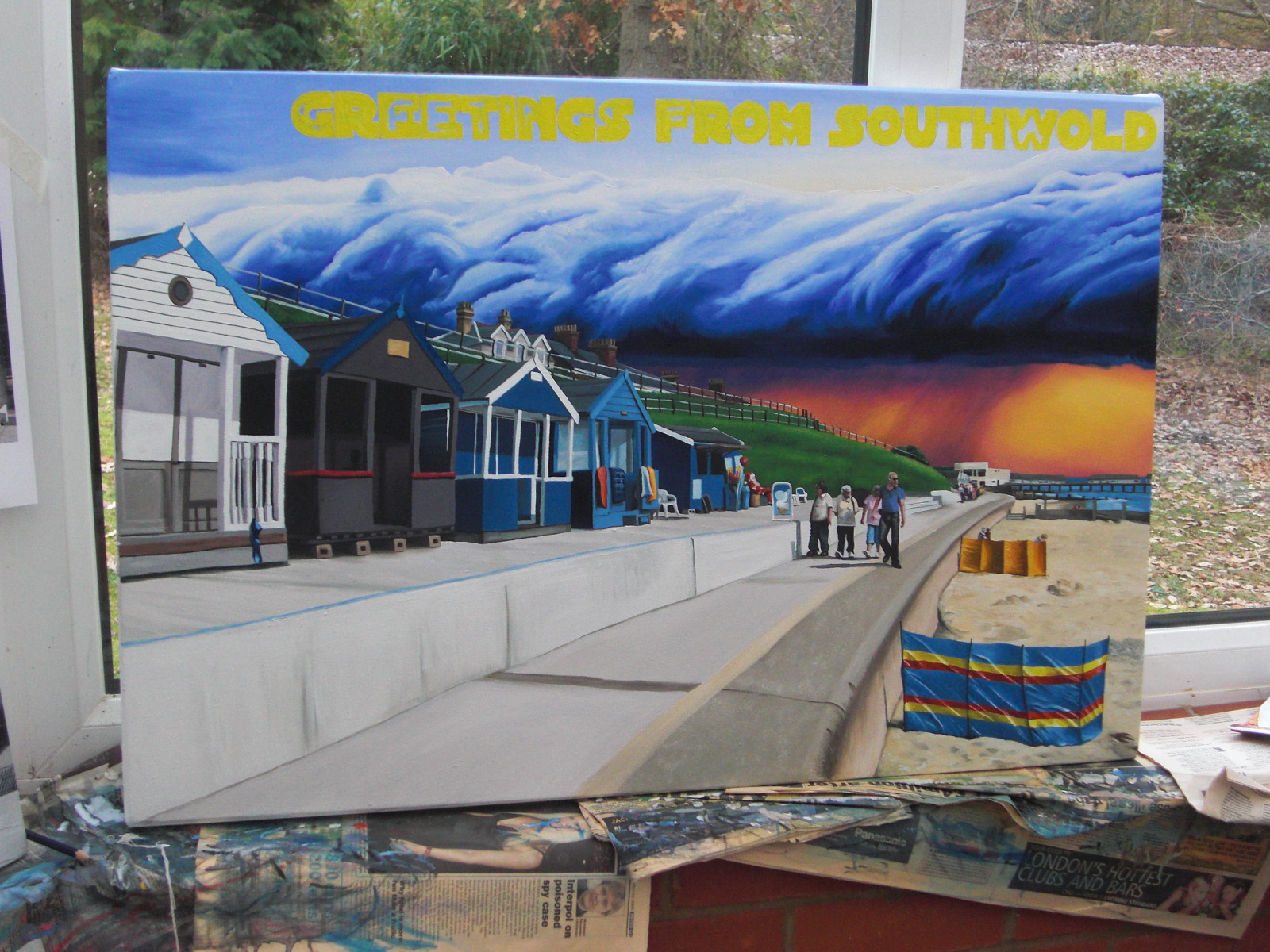
After thought, I hit on the idea of taking my postcard imagery back to it's roots. This meant creating postcard sized prints of drawings that were originally created to subvert the postcard image. The size aspect of my work has always been part of the subversion, the paintings are giant postcards and while the drawings probably take more from tourist posters and their scale is less of an issue, they also have links with postcards and as such are also far too large to be realistically postcards. But it was important that they really resembled postcards because I had found another way other than size to subvert the postcard.

Drawing version

My initial idea took some time to pull off. I knew that I wanted to play with the postcard itself rather than the associated imagery. I already had the imagery, but what else was there to subvert that would also fit in with the desire to take them back to postcard size. The answer seemed obvious when it hit me, material, however while printing on normal paper was no issue and produced some really interesting results printing on anything else I had in mind was fraught with difficulties. However in the end I managed to produce a good result printing onto tissue paper.

So why tissue paper? Well most importantly was the aspect of fragility inherent with it. Tissue is so easy to tear and crumple, and doesn't stand up well to damage of any kind. It would not cope with being posted, transported, put through machines or any or all weathers. It is also quite transparent and so trying to write on the back would obscure and alter the image.

Drypoint Plate

As I said I wanted to colour these images as well. I really wanted to see what effect reintroducing colour into an initially monochromatic drawing would have. It also seemed natural to add colour and make it resemble traditional postcards even more. Initially I have chosen to hand colour as I could control the colour better than I could using printing processes (I am a painter after all). I wanted to use drawing inks to maintain transparency and depth/clarity of colour however it also meant that the inks were not light fast At first I thought this was a problem but actually it added another dimension of fragility to the postcard print. I did know that I wanted the colouring to be as much as possible block colour, tone and line being defined by the print. As such the colour of the sky was an issue, do I have it black or do I introduce a stormy apocalyptic sky? However I realised that strangely these skies should be blue, unlike all my other works. Blue skies meant that block colour was easy and they looked even more like traditional postcards.

Print onto paper

Like all traditional printing techniques you don't get exactly the same print twice. With drypoint I have been getting quite a variation in strength of line. Each time you print you need to reapply the ink and prepare the plate. As such the surface sometimes has more ink left and sometimes less. No prints are the same, especially so when you also start to hand colour them.
The first attempt at hand colouring was almost disastrous as I didn't realise that the shellac based ink would dry and stick to the paper underneath the print. As such I had to very carefully peel the print off the paper. Since then I paint sections fast, move the image frequently and dry them hanging on a rudimentary washing line.
Millennium Dome Print on Tissue

So why have I only started doing prints? Well the last time I had access to a good print studio was back at university (2003-06). Back then, while I picked up a few techniques, I was also only just understanding what this obsession with postcards was and was concentrating on getting the paintings right. I can do this now because I have found the wonderful resource that is the Printmaking Studio at South Hill Park Arts Centre in Bracknell, Berkshire. I signed up to a course because I needed the experience of full time printmakers to assist me. Currently the Artist Printmakers in Residence are Chris Smith and Holly Drewett but I've mainly been working with Holly, who is a star even if she keeps trying to get me to print in colour :P

So future plans for the prints.

Well as you may have seen from the website already I have prints on there right now. I plan to release a new one every month so stay tuned. I need to look further at ways to frame and exhibit them and I am thinking about other print process other than drypoint that I might use. These would have to be processes like drypoint to achieve anything a finish that is anything like the original drawing, but could be etching or solarplate.

Final Coloured Version